When Beckie from Infarrantly Creative asked me to join her State Pride tour, I jumped at the opportunity to represent California! Together with 30 bloggers, representing 30 states, we’re putting together a blog hop with projects that celebrate each of our states! I’m following Stephanie from Somewhat Simple, so if you missed her Arizona project, make sure to check it out!!
We’re moving from California to Ohio in two short weeks, so it’s the perfect time to celebrate our home of the past two years!
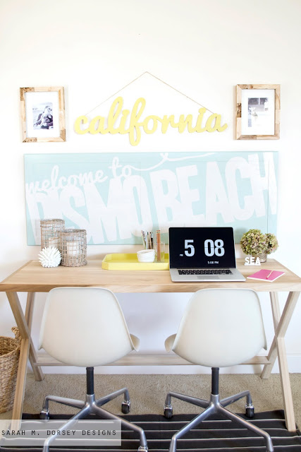
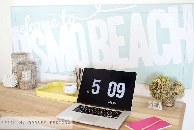
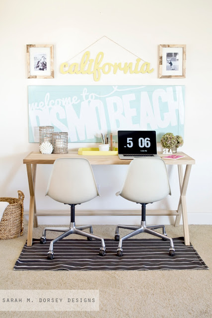
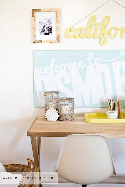
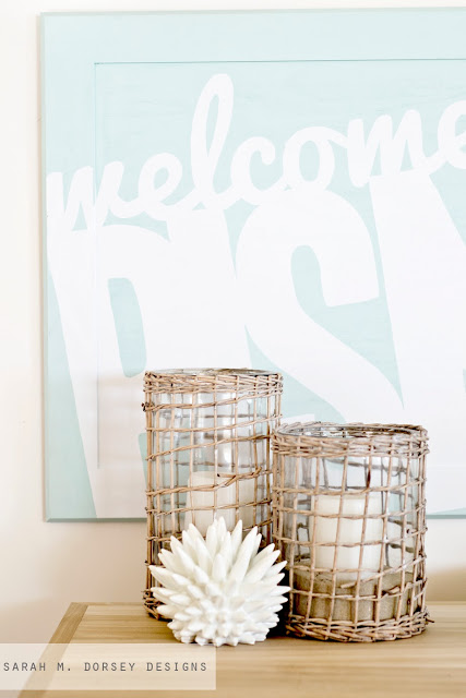
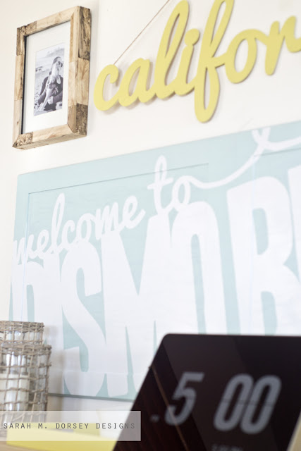
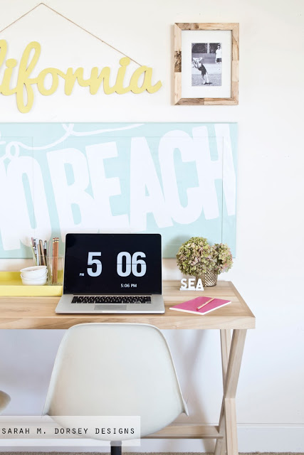
When I think about California, I instantly think about sun, sand and water. So I decided to create a gallery wall using our driftwood frames, a cut out of the text, California, and a cabinet door turned into a beach sign.
Here’s how we did it!
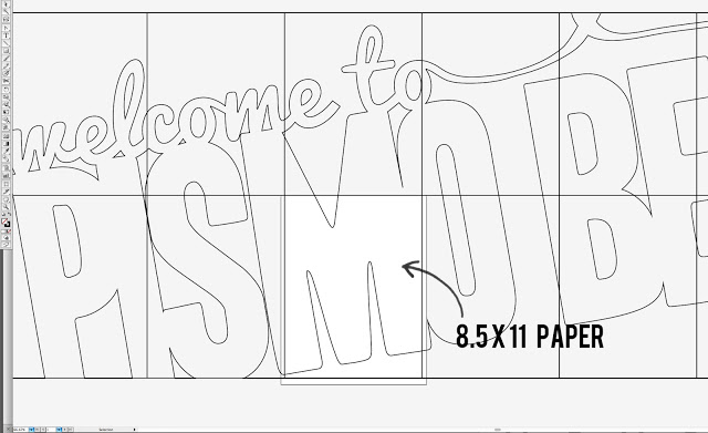
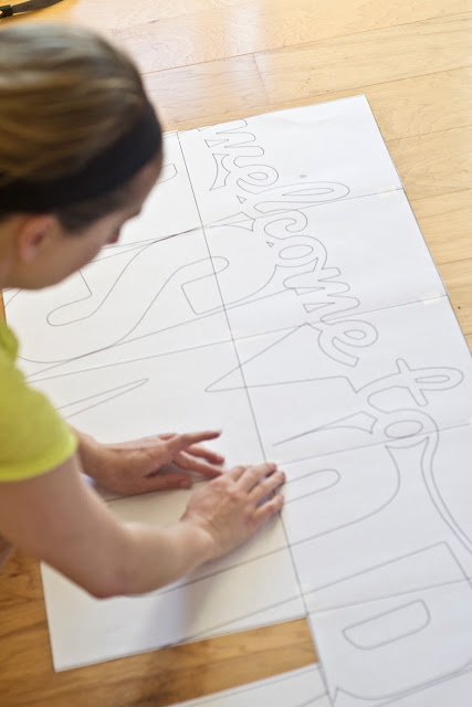
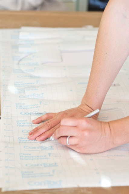
For the beach sign, we created a text document to scale in Adobe Illustrator. Then we made a grid (so that the text would line up easily) and printed sections on 8.5 x 11 paper. We shifted the text on the printable space until the entire document was printed. Any print shop, such as staples or Fed Ex office would be able to print large scale if you’d like to skip the printing and taping step.
Then taped it to a large sheet of cardboard and taped transparent contact paper overtop and cut out with an xacto knife.
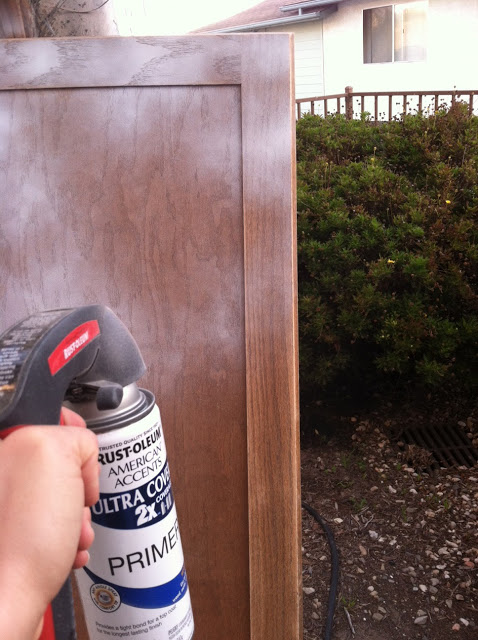
We primed and painted a large cabinet door.
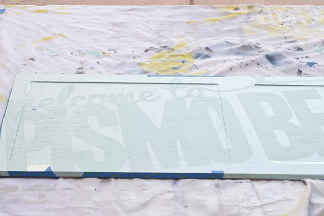
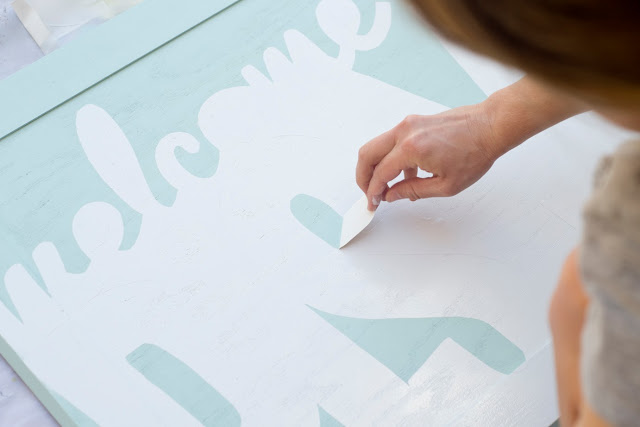
Once dry, we removed the backing and placed the contact paper on the cabinet door, pressing down all of the edges.
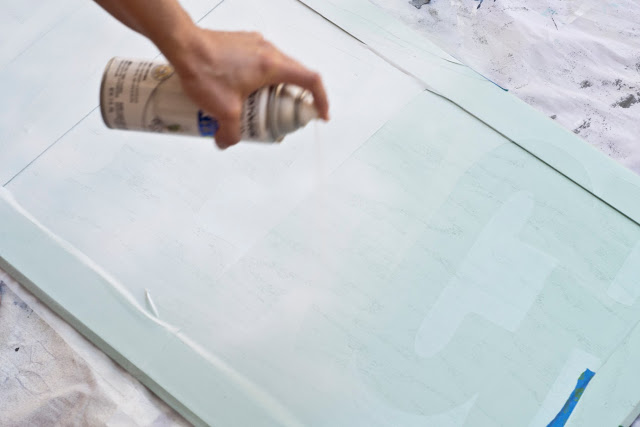
Then using white spray paint directly above (to avoid it going underneath any loose edges). We sprayed using two thin coats, letting it dry about 30 minutes between coats.
Letting it dry about 5 to 10 minutes, we took off the contact paper and attached hanging hardware on the back.
and that’s it!
For the California cut out, we repeated the first step of the beach sign, printing and taping the text together.
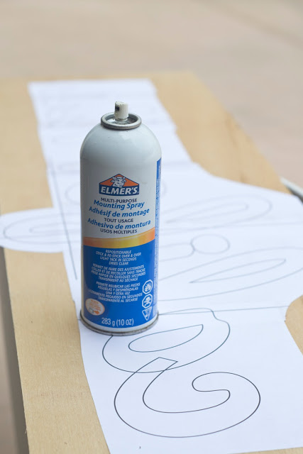
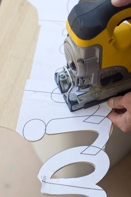
Using spray adhesive, we mounted the printed out to an 1/8″ piece of luan.
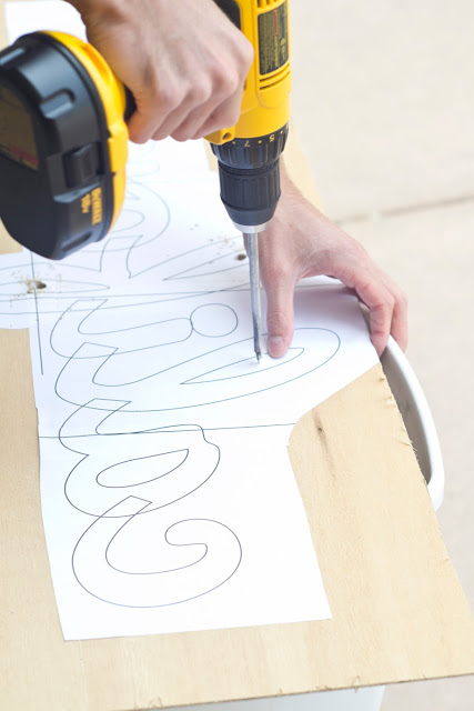
Drilled holes in the closed areas for the jigsaw blade to enter.
And cut it out with the jigsaw, using a blade designed to cut slowly and minimize splintering.
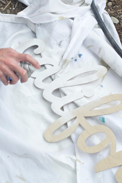
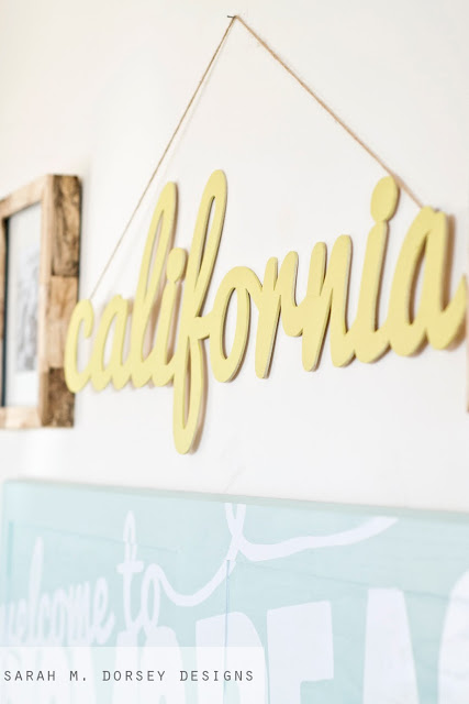
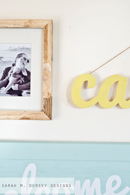
We primed and spray painted with Rustoleum Lemongrass. Finally, we glued a piece of twine on the back to hang it. I love the simplicity of it!
We paired it with a few of our driftwood frames, made from CA driftwood that we milled, tutorial here
I love the bright colors paired with the beachy wood!
Click here to see how we made this campaign style desk and here to see more about the Eames chairs
Be sure to head over to DIY Show Off next, to check out Roeshel’s Pennsylvania inspired project!!
Thanks so much to Beckie for organizing this state pride tour!!

Fun Sarah 🙂 Great idea! xo Kristin
What a fun idea for a blog party, and what a great project!! I love the colors you used.
love the colors and design! looks awesome as usual, sarah!
Beautiful, as always, Sarah!
I love this Sarah! What a beautiful tribute to your home for the past two years. Good luck with your new journey in Ohio! (p.s… I can't ever get over your photography, it's PERFECT every time!)
Wow this is so cute!! I just love this tutorial! Thank you for sharing. I love how you give step by step instructions with really clear pictures. You make it look like it is easy enough for a non-creative person to be able to accomplish. Thanks again!
Where did you get the desk???? Did you make it?? It is adorable yet simple which is exactly what I'm looking for.
We made it 🙂 Here is the tutorial http://sarahmdorseydesigns.blogspot.com/2013/02/how-to-build-campaign-style-desk.html
man, you don't mess around! what a lot of work…looks great, sarah!
I adore the bright colors with the beachy wood too. So pretty!
I love this project!! And it so exciting to "know" another California blogger.. even if it is only until you head to Ohio!
Is there anything you cannot do? I love it…you need to figure out how to bottle your creativity…I'd totally buy it! 😉 😉
Absolutely gorgeous!
Can you tell me which font you used for the california sign? I have been looking for a good scripted font for a while, and that one is gorgeous!
Hi Jenn! It is Pacifico
Oh my, I love this! Great job!!
Ooooh! I want to make that Welcome to sign, but I'll change the town to San Diego! What a perfect beachy design!
Love this Sarah.
You have such a great eye for design. I am in love with everything you do!