I’m so excited to participate in the spring 2020 One Room Challenge! I’ve participated two other times (HERE and HERE) Both spaces are areas that we use in our home ALL the time. ORC gives a push to complete spaces in an 8 week timeline. If you want to more details on the ORC and to see all the featured designers and guest participants, check that out HERE.

We’ll be tackling our loft space, outside the master bedroom and the new loft above the master bathroom. We are almost done with the master bath, so I’ll be sharing that along the way as well!
Here are a few before images. The image on the upper left is what the space looked like when we moved it. The only way to enter the bathroom was through the loft, which we didn’t love. We decided to relocate the door from the bedroom and incorporate the closets and walkway into the bathroom. We added drywall and lowered the ceiling so that they upper loft could be accessible (this is what it looks like now). It ended up working well to lower the ceiling over the bathroom because the rest of the lowered ceiling height houses the recessed lighting and exhaust fan.
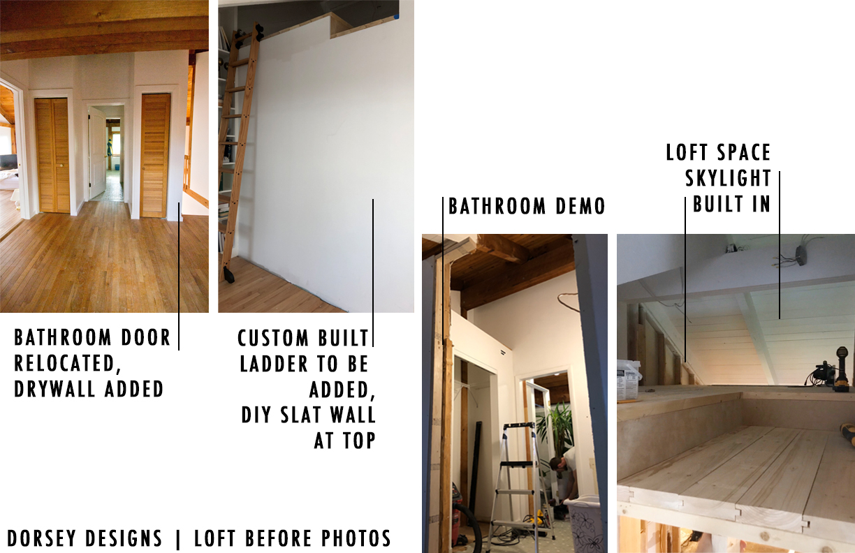
The bathroom originally had a center wall and lofted ceilings. It could have been nice to have tall ceilings in here, but we needed a place to house the supplemental HVAC that is needed for the bedroom and bathroom. This was the best place to include something that wouldn’t be an eye sore. We’ll be building something around it to hide it. Plus, having lower ceilings keeps it warmer in the bathroom. The photo on the right (of image above) is what the loft looks like now.
Here’s a before of the loft outside the bedroom (the bathroom and loft above are directly to the right)
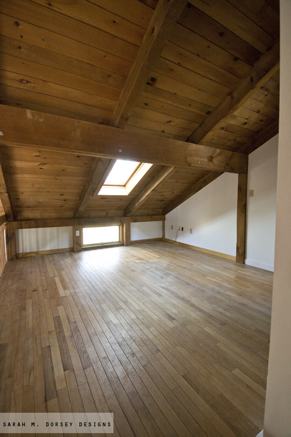
Since then, we’ve painted and added built ins (image on right of inspiration board)
Here are my plans for the space!
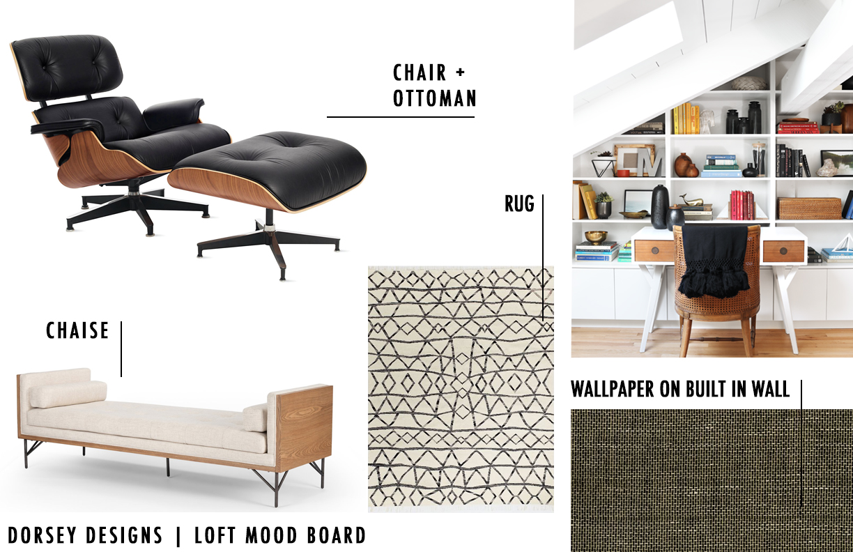
We have a vintage Eames lounge chair and ottoman (found second hand years ago!) The rug will relocated from the guest room, it’s one of my favorites! I’m considering adding wallpaper behind the built in. Though I did remove everything from the shelves and I loved how bright it is, so I’m still deciding. Originally, this space was intended to be a home office for David, but since it’s open to the rest of the house, that didn’t work great with the kiddos. We’re considering adding a chaise here instead (stay tuned for final layout!) We have an existing skylight in this space from VELUX. Our house is 40 years old and it’s held up great, but it is time to replace it due to the age. We’re so happy to be working with VELUX to replace this skylight and add one to our loft space. It’s going to be a game changer and let in so much light!
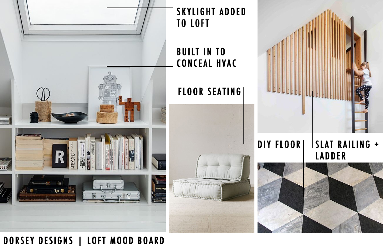
Here are our plans for the loft above the bathroom. Add a skylight (this is going to be amazing!!) Slats in the opening with a custom ladder to the right. Floor seating, and a killer floor. Finally, a built in to conceal the HVAC so you don’t know it’s there! I can’t wait to share more along the way.Stop back next week for week 2 updates! Check out the other week one ORCs HERE!
This post could have used a little more careful editing, but I always love your designs!
Thanks Teri! Yes, difficult to get the post done with a screaming baby!
yikes that’s rude
this is gonna be SO good!
Thanks Cassie! I can’t wait to bring these spaces together!
This is such an amazing space to play with! That planked angled ceiling is amazing
Thank you! I”m looking forward to it!!