We’re entering the home stretch of our master bath reno (time to start installing the pretty things! YAY!) While it’s taken a lot longer than we anticipated (doesn’t it always!?) .. we’re getting the high end look that we want for less since we are doing most things ourselves. First, we demoed the entire space, including three surrounding closets to enlarge the bathroom slightly.. We also decided to add a loft above – to hold the supplemental HVAC for the bedroom/bath (it is hot in the summer and cold in the winter, so we needed to do something more permanent) Plus, I love that it will create an extra room! We reworked all the plumbing and electrical as well. So far, we’ve hired out the drywall, we will probably do the rest ourselves.
We spent a lot of time on the layout – we reworked the entrance so it enters from the master bedroom. Originally, it entered through the loft outside of the bedroom. The most challenging space planning issue was that it also needed to enter to the office loft – so we created a walkway (by placing the doors across from each other) instead of walking all the way through the bathroom. Overall, I’m really happy with what we’re able to fit in the space!
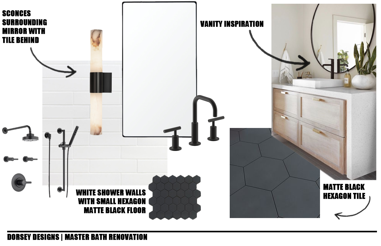
We also spent a lot of time selecting finishes. Here’s our final plan!

sconces // subway tile wall // floor tile 10″ hexagon // shower tile 1″ hexagon // faucet // shower system // vanity mirror // countertop (we’re deciding between soapstone and leathered black granite // solid oak vanity (we’re DIYing!) // hardware (we’re also DIYing) // toilet
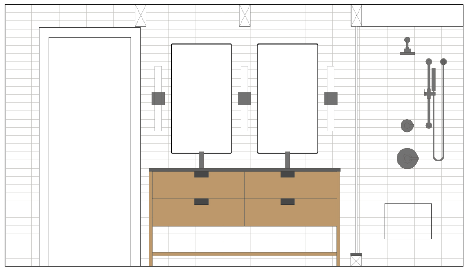
We’re still deciding on the tile layout. Here’s a few mock ups that we did in Illustrator. We’re using THIS tile from The Tile Shop
HORIZONTAL STACKED

VERTICAL STACKED

VERTICAL BRICK

BRICK

VERTICAL HERRINGBONE

If you have a preference, let us know! We’re still deciding ..
We do mock ups for everything to make sure that we are happy with the direction moving forward. There is nothing worse than impulsive diving into something that is time consuming and expensive – wishing that you did it differently! If you don’t have Photoshop/Illustrator – you can do mock ups in PowerPoint or even Instagram Stories! Though for items where scale matters, using a program such as Illustrator or CAD (or grid paper) is important for proportions!
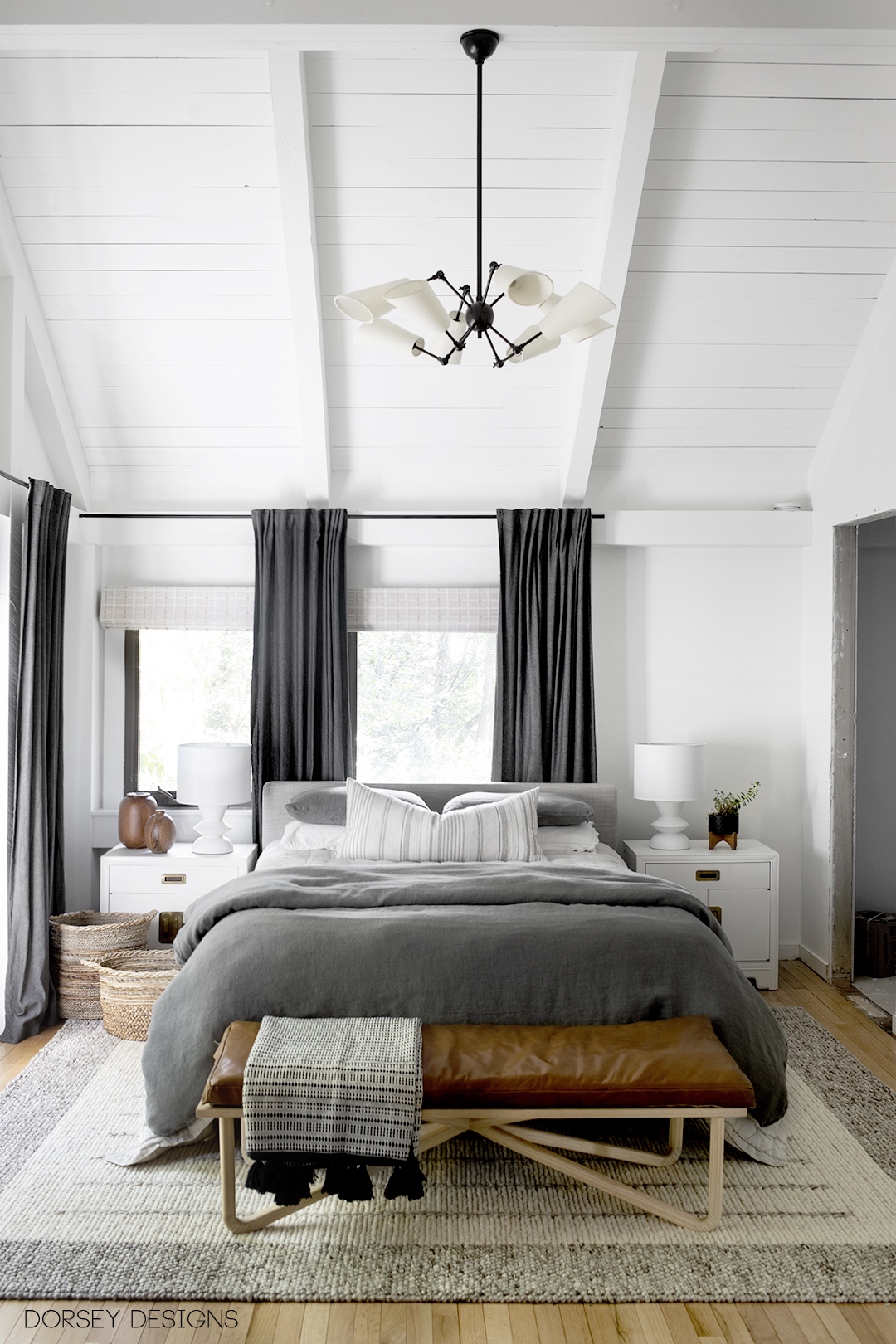
We’re also doing a bedroom refresh! Stay tuned for updated photos with Annie Selke soon! I love the direction that it is taking! Sources linked below!

rug // quilt // duvet // throw // lumbar pillow // nightstands // lamps // bench // drapery (Ikea discontinued) // roman shade // chandelier
I like either of the stacked options, but whatever you choose will be beautiful! Can’t wait to see what you decide.
Thank you for voting!! I love the stacked too!
Horizontal stacked is my favourite layout for the bathroom tile. It pairs so nicely with the vanity as a juxtaposition to all the vertical elements – door, mirrors, sconces, even the shower wand hose.
Thanks so much for voting!
This is such a good idea to use Illustrator to mock up the layouts. I personally like the cleanness of the stacked horizontal. The herringbone is nice but feels a little more decorative. I wonder if you could use that pattern the the shower area & something more streamlined elsewhere. My least favorite is the brick pattern. Can’t wait to see what you do in your bathroom!
Hi Jacqueline, thanks so much for your vote!
I really like the vertical brick tile – I think it reads really nicely with your long narrow sconces (which are to-die-for, btw!) I’m not a huge fan of stacked tile, personally, but no matter what you guys do, it’ll be amazing!
Thanks so much for your vote!