Hi I hope that you had a great weekend!! Ours went by so quickly! We finished one project and almost finished a few more. I’ll take pictures today – so look for a project post tomorrow or Wednesday!
—
A few weeks ago I finished an e-design project for a living room/entry way. My client, has a fabulous space, and a great starting concept! She just needed a little help pulling everything together so that it would work in her space.
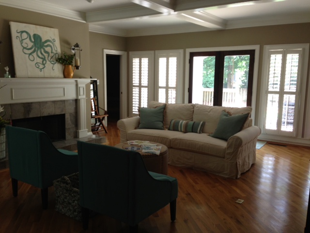
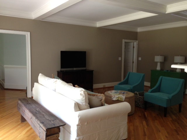
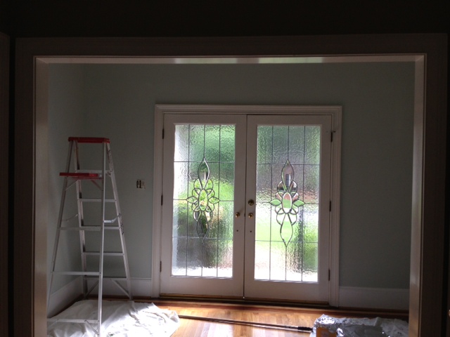
The living room has a gorgeous coffered ceiling, large windows and beautiful hardwood floors. Such a great starting off point, right!? This room is primarily used for causal entertaining and gathering. So plenty of seating was a must.
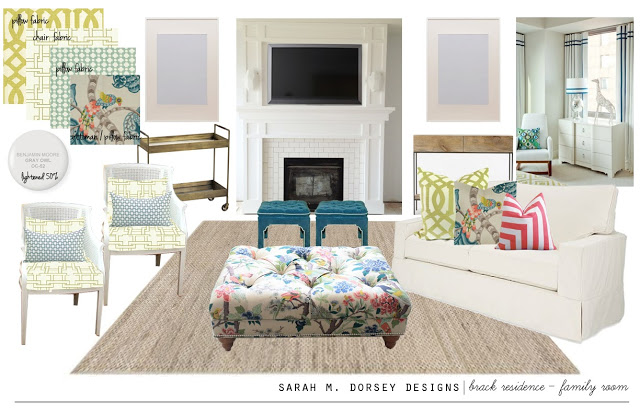
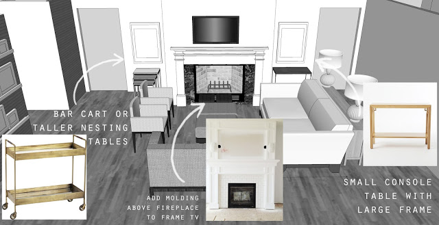
Since there were two focal points (the tv and the fireplace), I proposed wall mounting the tv above the fireplace to create one focal point.
The plan is to extend the molding on the fireplace to the ceiling and frame the tv, similar to Sarah Swanson’s fireplace, lighten up the walls with BM Gray Owl, lightened 50%.
I used one of my client’s favorite fabrics, Braemore Henrietta Turquoise as a jumping off point. I love it on a tufted ottoman, similar to the one Kirsten used here. It’s perfect for propping your feet up, or put a tray on top to hold drinks and snacks.
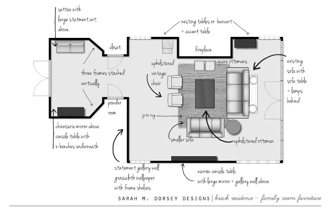
She has an existing slipcovered sofa so the space planning started with that.
A seating area was created around the fireplace. My client found a pair vintage caning chairs (similar to my chartreuse chair) and is getting them reupholstered in this amazing fabric by Thom Filicia.
A beverage cart is perfect for entertaining without going back and forth to the kitchen.
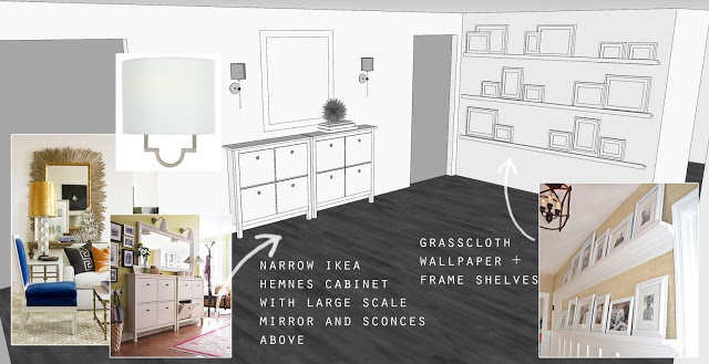
The wall against the foyer has a tight walkway, so frame shelves are perfect to add interest, but not obstruct the walkway.
Adding the second sofa made the walkway a good bit tighter, so adding two shallow cabinets is an inexpensive way to add storage.
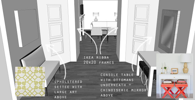
Finally, here’s a view looking into the foyer.
The foyer design started with an existing chinoiserie mirror (not in photo), a simple parson’s table with x benches underneath. And a small settee with large art above. I love the idea of the angled walls with floor to ceiling frames.
I had SO much fun working on this space. I’m looking forward to seeing finished pictures!
Most of the sources can be found on my Pinterest board, feel free to ask if I missed one. I’m still in the process of setting my my design services page, so if you’re interested, look for that soon!
It is SO nice to see a space in 3D before going through with it! What computer program do you use for this? Thanks! Your work is beautiful!
-Jessica
Hi Jessica! I use SketchUp and then add the photos and text in Photoshop 🙂
I am hopelessly in love with coffered ceilings. Love everything you've suggested here, great ideas and beautiful fabric combos!
Love it! The palette is so fresh and welcoming. And the fireplace is going to be absolutely amazing!
I love your plan Sarah. Such a great use of space!
This looks great! I love the idea of tying the 2 focal points into one!
I can't wait to see the finished pictures myself. Looks like an awesome space to start with too.
Such a beautiful space to begin! It's fun that the floors are laid on the diagonal. Your design will just enhance it's beauty! Can't wait to see more!
Can't wait to see the finished product, love the plan you came up with!
Gorgeous mood board! That's going to be amazing!
Love the octopus painting. I didn't see that sourced. Where is it from?
The octopus painting is existing, I'll check with my client to see if she remembers where she found it 🙂
Ok, thank you.
Wow – looks great – and so pretty!
Such a beautiful design! Cannot wait to see the finished product!
Kayla,
http://adelightfulplacetodwell.com