Hi Friends! I’m SO excited to reveal our One Room Challenge™ Spring 2019 – the main space in our home – the living / dining room!
Here we go! Lots of photos and sources below!!
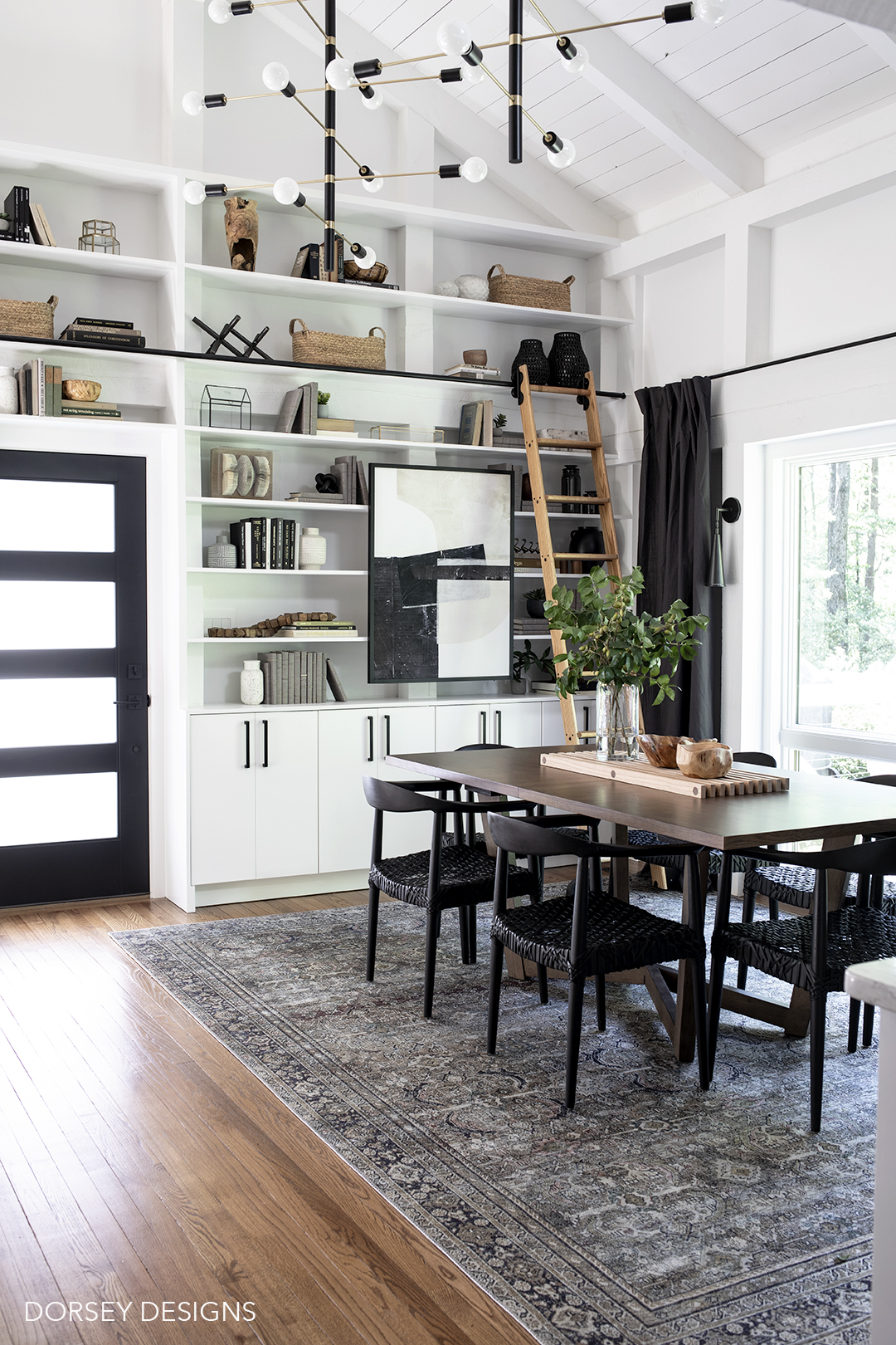
After years of buying/collection random furniture/accessories that I liked – I ended up with a sea of gray. I was so excited to finally pull together an intentional design that is also functional (hello toy storage!) Now, we have a space that we love being in! (all sources will be linked at the bottom of the post)
First, a few before photos of the dining room!
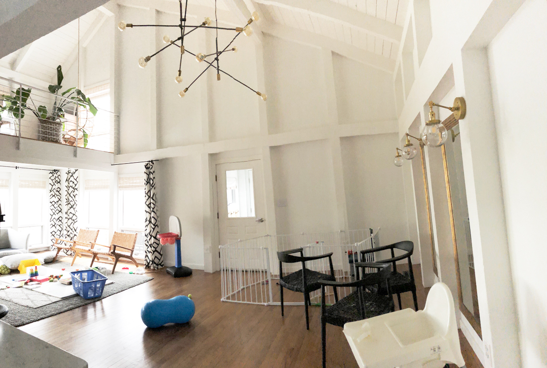
Zero natural light, so these mirrors were a good placeholder (spoiler alert, we added windows!)
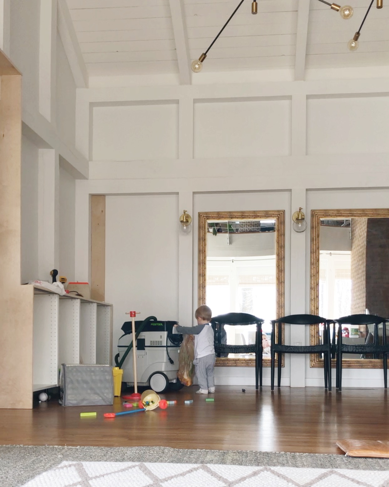
and one from when we moved in.
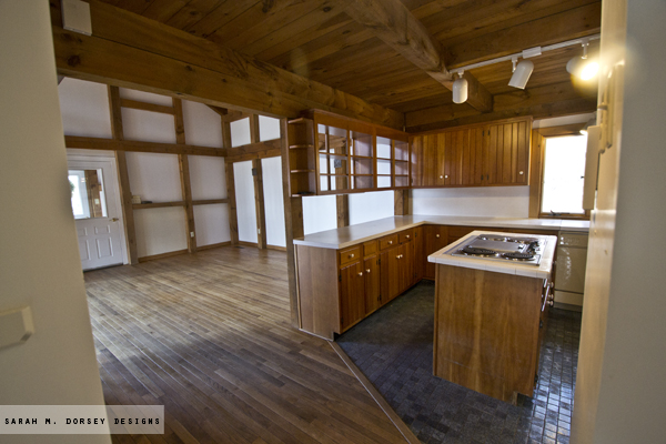
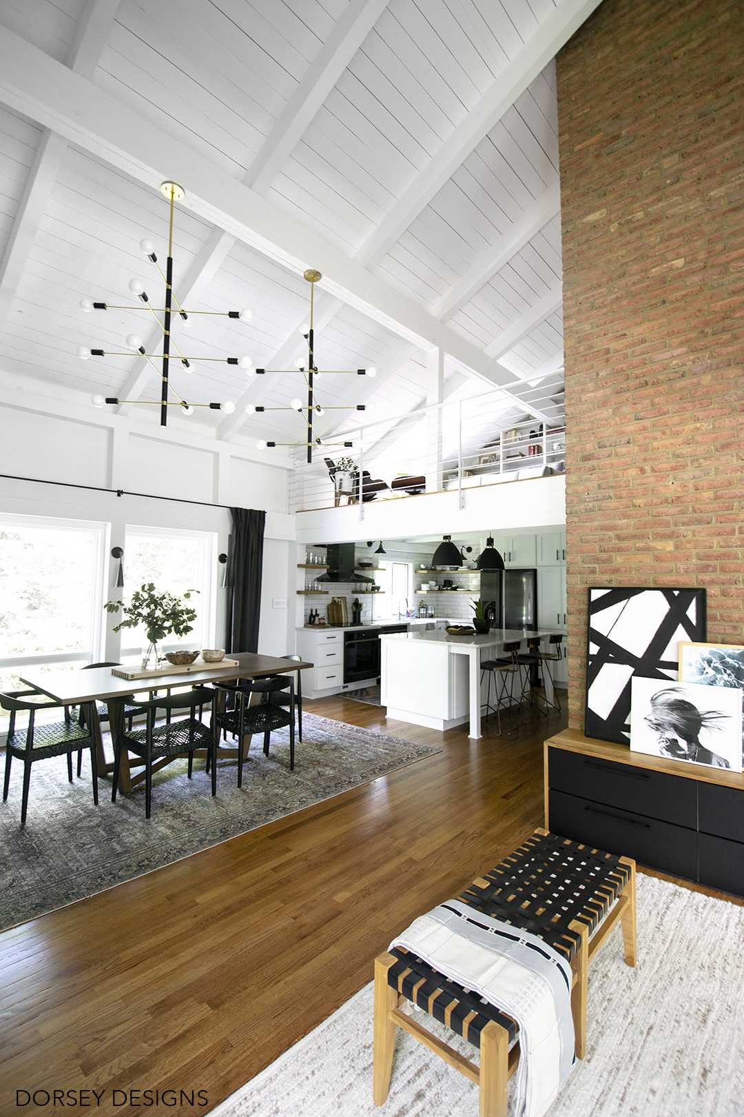
Oh how I love this view now! We renovated our kitchen last year (check that out here) and that was definitely a game changer. Having the rest of our main living space complete makes it even sweeter! Kitchen stools are West Elm (discontinued)
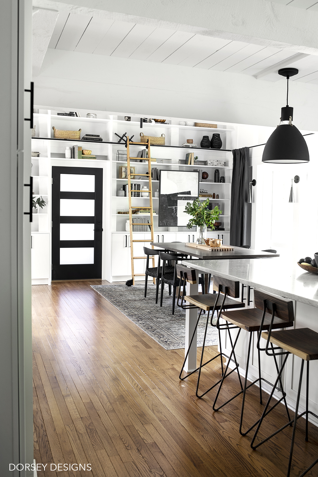
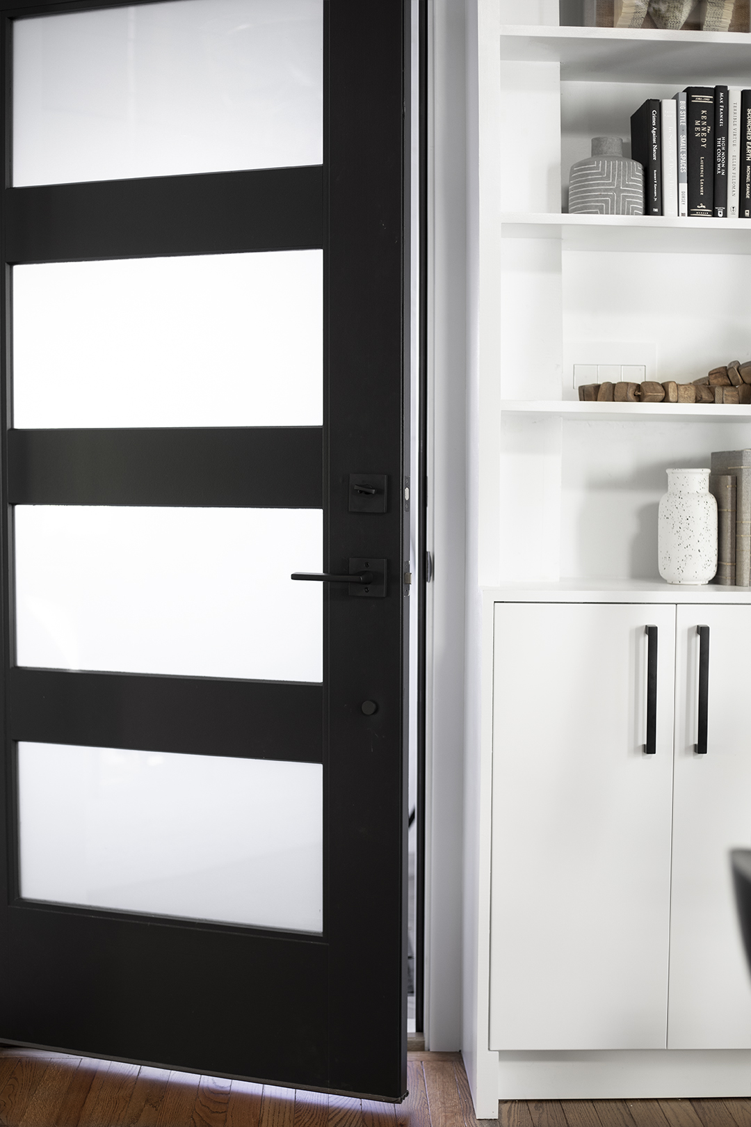
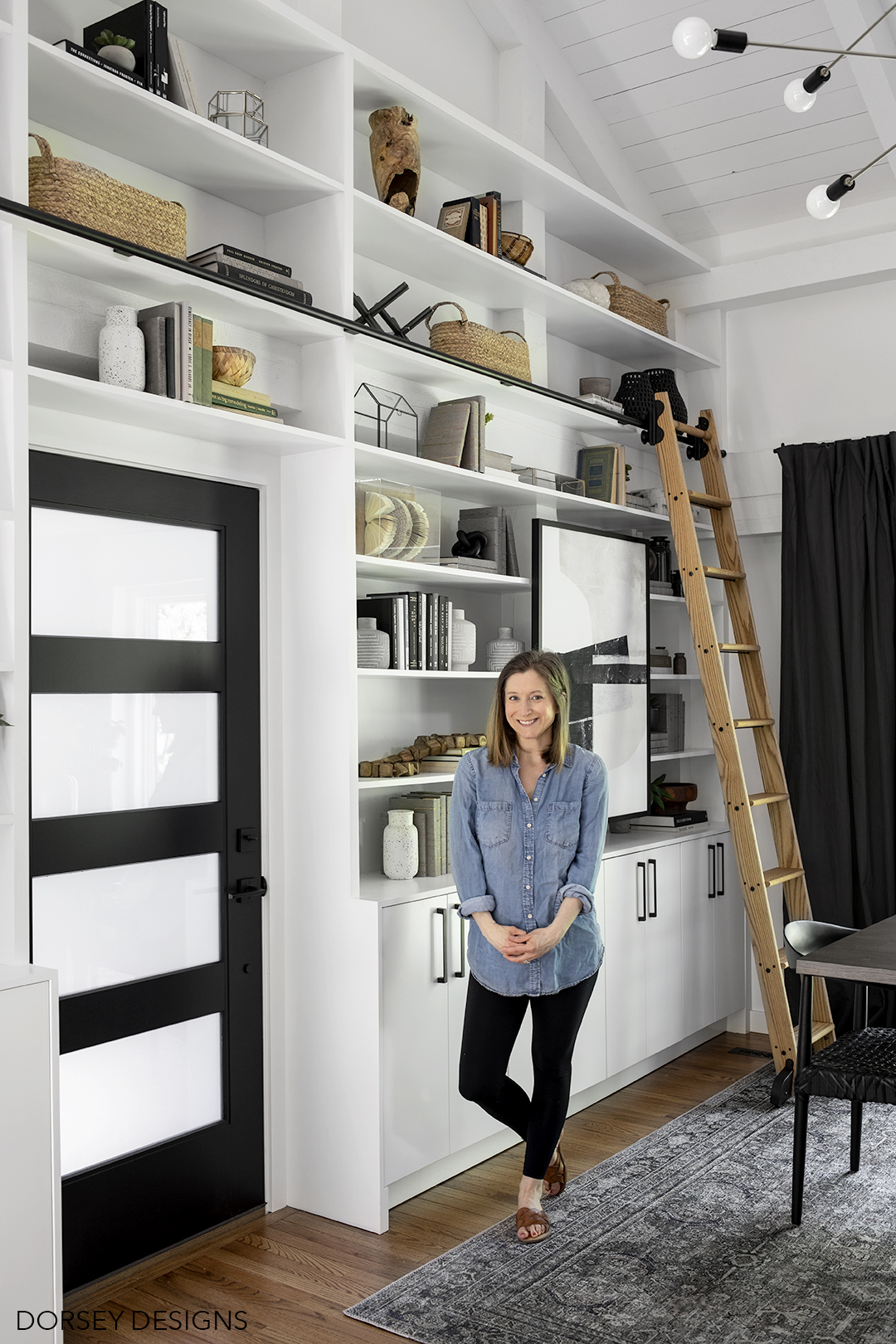
I’m OBSESSED with our new modern front door from The Home Depot. I love the black, four panel frosted design which allows lots of light in but privacy as well. We completed it with a matte black front door hardware from Emtek – I love the finish, design and it is super heavy (quality is AMAZING!)
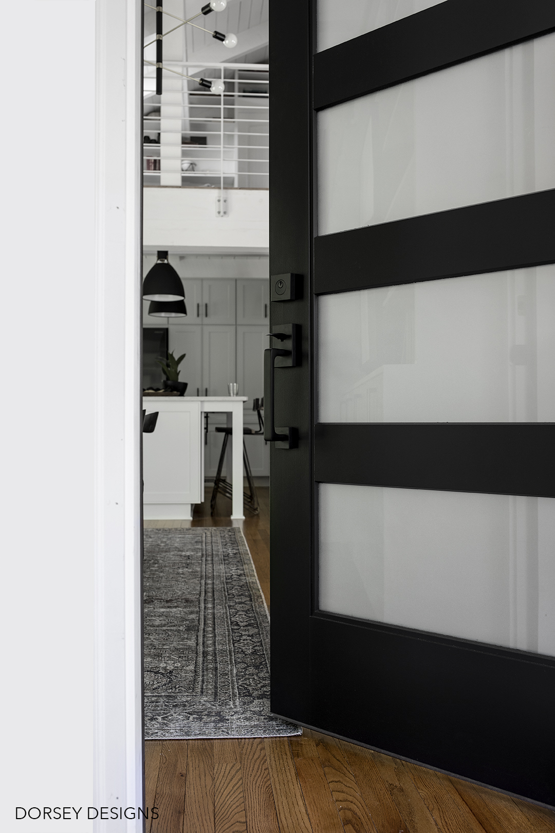
David’s dad helped us with all the electrical – almost all of the lighting is from one of my favorites, Hudson Valley Lighting group and the sleek switches are from Legrand (I LOVE the minimal design and touch switches!) See how it just blends in to the wall to the right of the door. Love them!
Our new chandeliers from Mitzi (part of the Hudson Valley Lighting Group) are showstoppers – I love their scale (this space needed something large!) and brushed brass/matte black finish. We finished them off with larger frosted glass bulbs from Lamps Plus. They provide amazing light – I love the natural color temperature 2700k and even light.
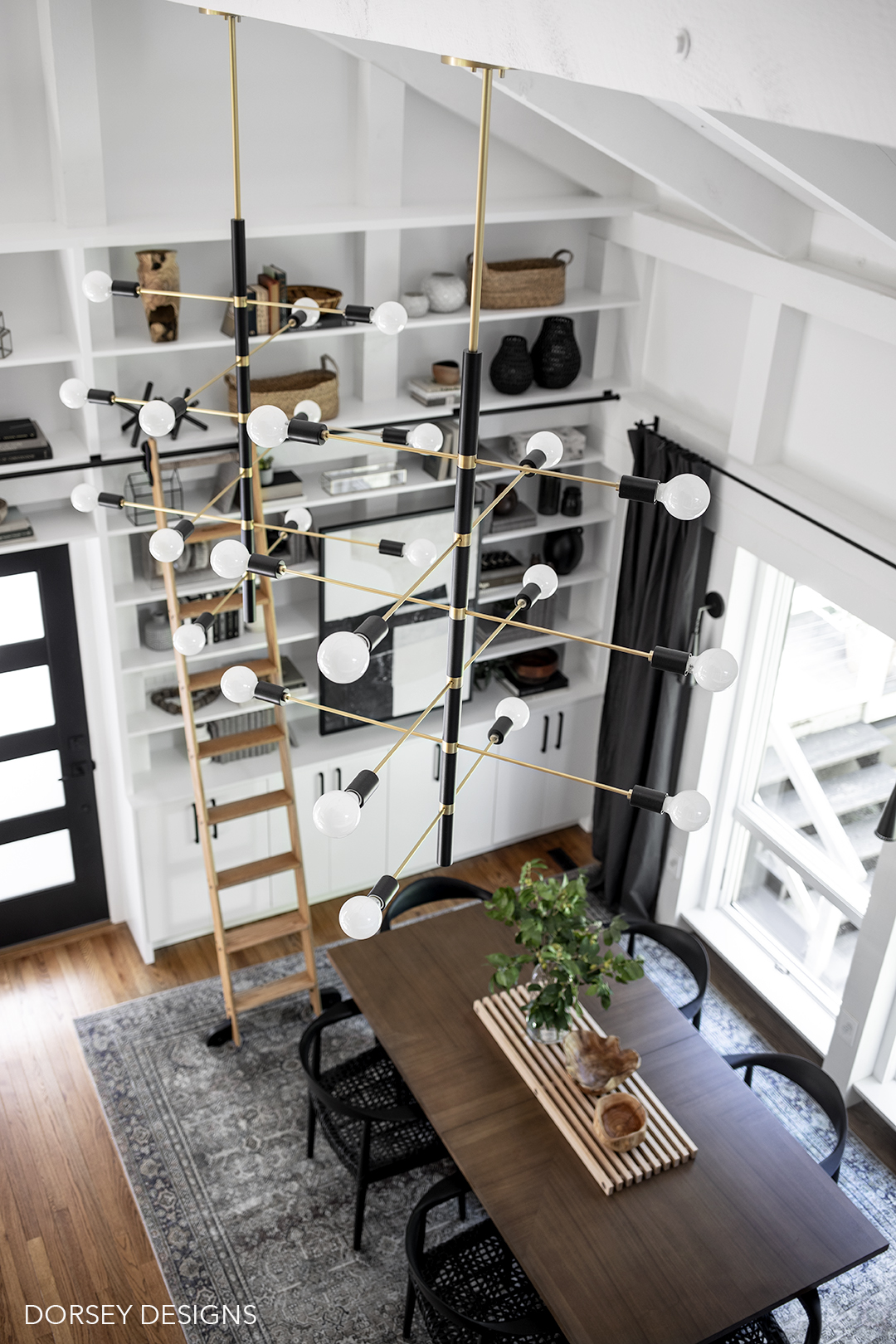
When we moved in, the dining room had zero natural light. I always envisioned windows in this space and so happy that we were able to finally install them! They really make all the difference – I can’t imagine the space without them now! We selected Andersen 400 series windows from The Home Depot to match the other windows on this level.
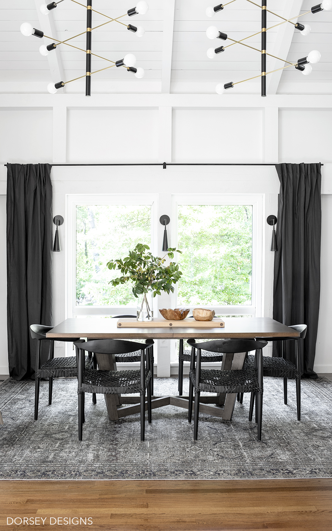
We finished the space off with a gorgeous rug from Loloi. It’s zero pile but still substantial (I think it will be good for wiping up!) Note: in person, I’d describe the dark areas as navy instead of black/charcoal – it has olive green (primary color), subtle rust/pink accents too.
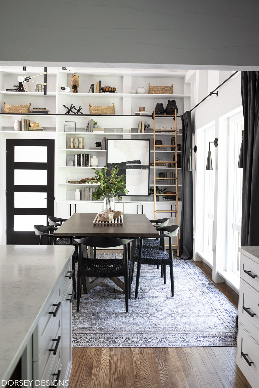
Chairs are a favorite of mine (available at Home Depot!) I love the black finish and woven rope seat (they are very comfortable too!) Stunning table from Overstock – I love the geometric veneer top and that it comes with a leaf (perfect for expanding when we have more people over!) The wooden trivet was a DIY from our new book (currently available for pre order!! Still pinching myself over that one)
GORGEOUS faux olive branch arrangement from NDI. I love having both faux and real plants in my house! The trick to having faux blend in seamlessly is selecting a high quality one that will last for years to come! I am so so impressed with the quality of this arrangement from NDI!
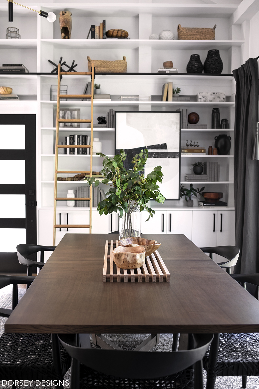
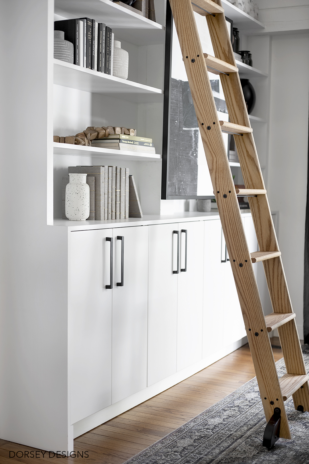
We DIYd the built in with Ikea Sektion lower cabinets and plywood with Metrie facer boards for the upper portion. For the facer boards, we used flat stock poplar and it made all the difference! It was so easy to cut to fit – using the correct materials makes all the difference for speed/ease of install!
I’ve also always wanted a library ladder – this one is from Home Depot! I love love love it! Though to keep our little guy safe, we had to remove it for now.
Stunning bowl is custom from Jill Rosenwald. I love it!!
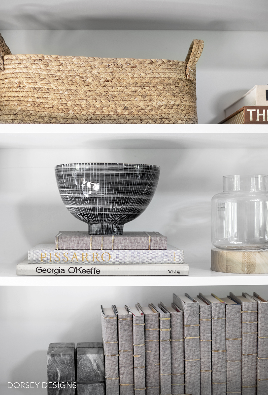
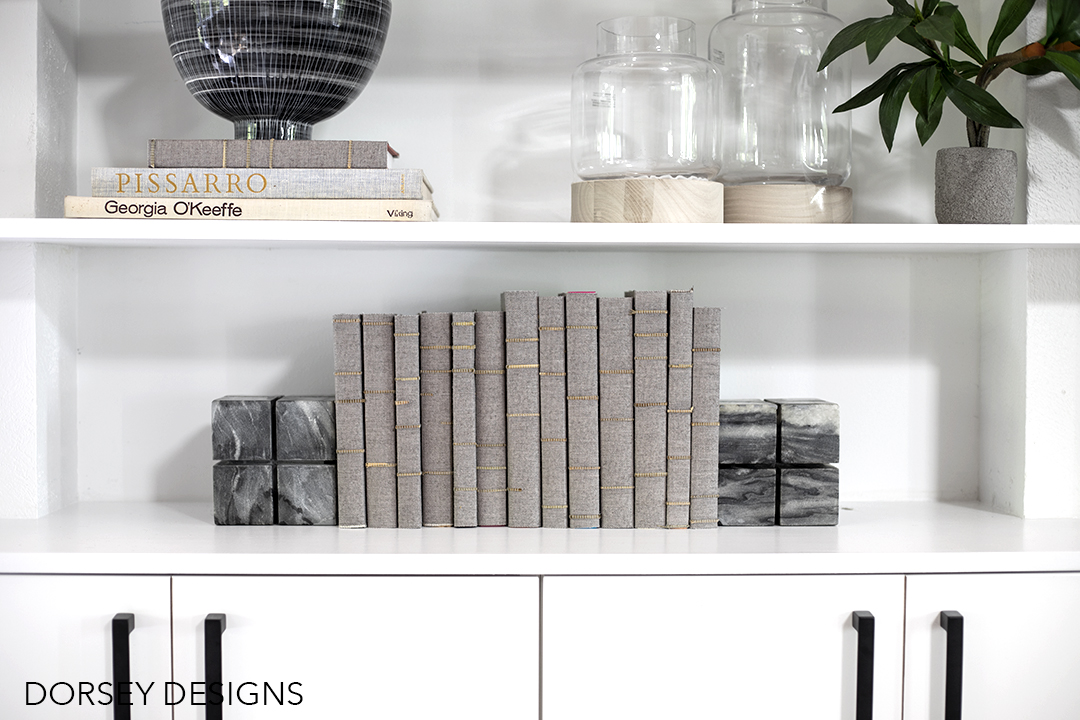
GORGEOUS wallcovering is from Pacific Designs! I was originally going to wallpaper the back of the built ins, but didn’t feel it looked good with the vertical posts. Wrapping some of the books was the perfect way to hide bright covers and add the same interest of wallpaper but in an application that works with our house. I’ve seen a lot of grasscloths and the quality of this is top notch – it is so so pretty!
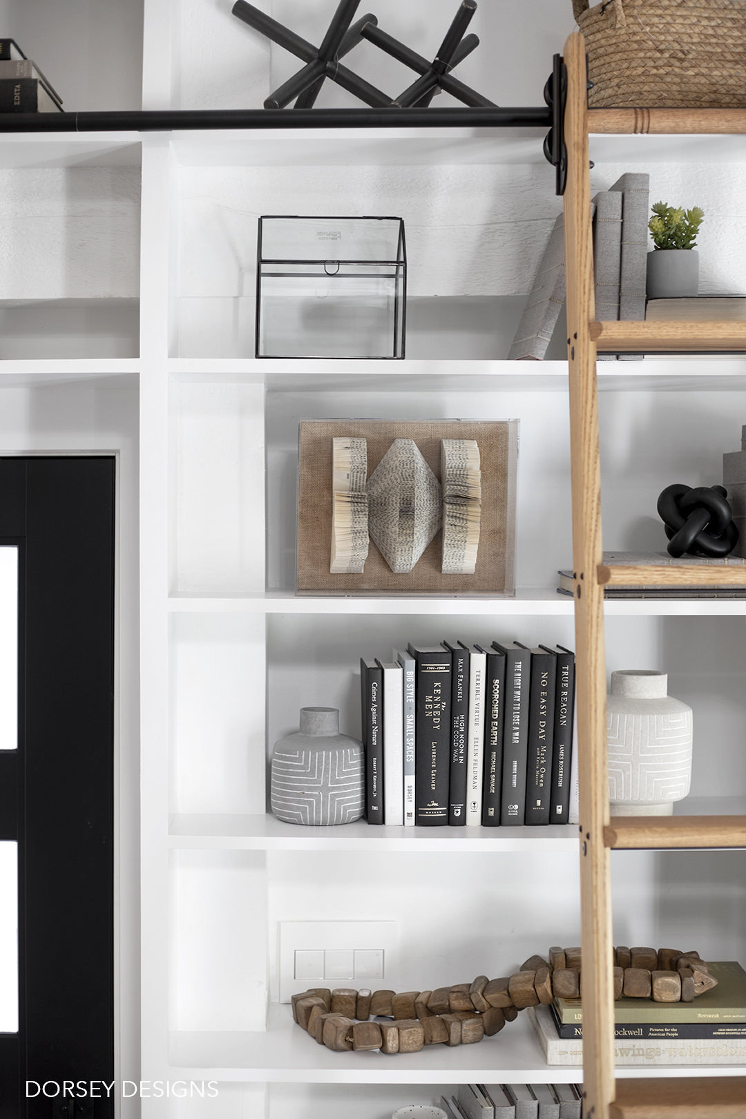
Folded book art is from Scout Design Studio. I love the dimension and texture that it adds!
Next up, the living room.
Before.
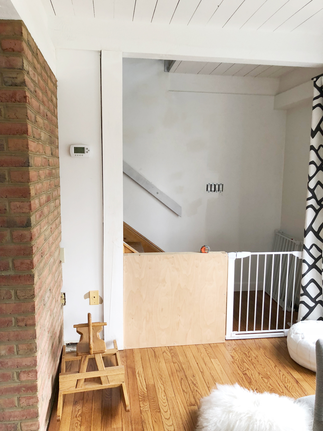
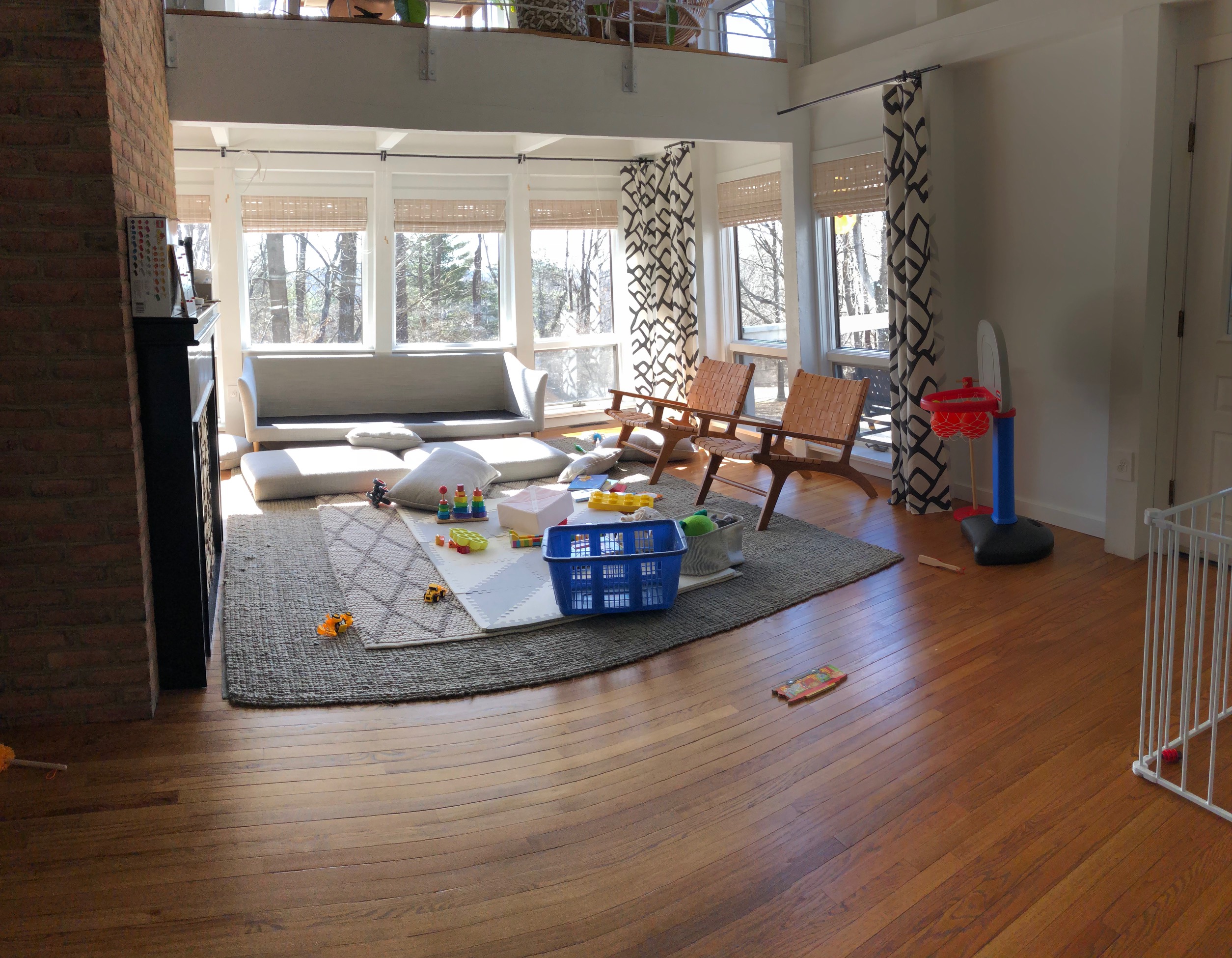
And when we first moved in.
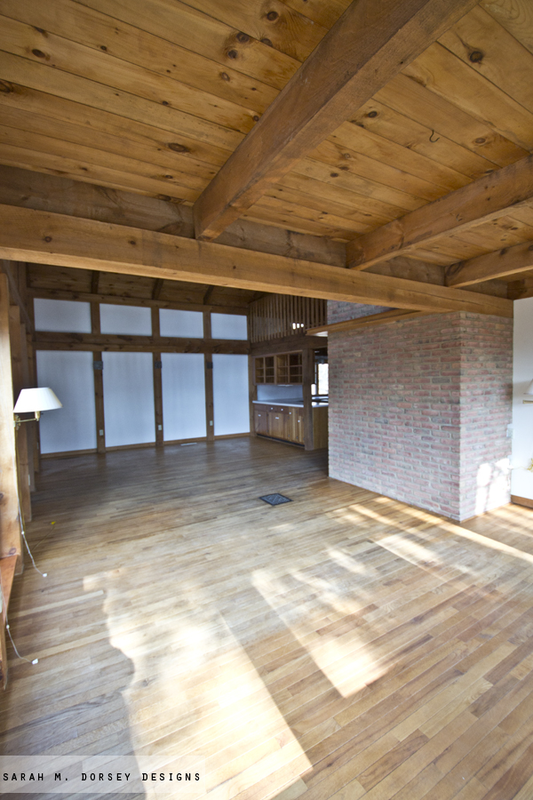
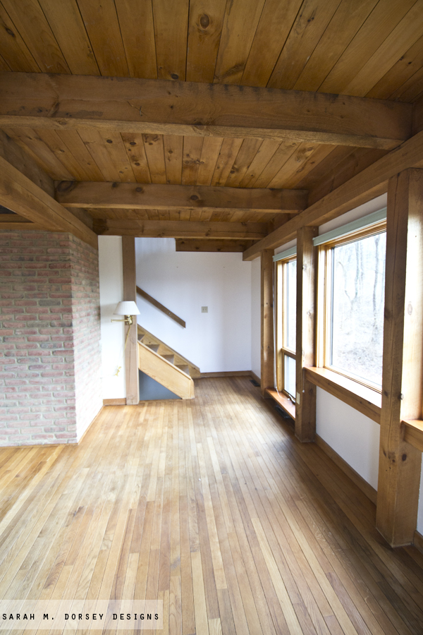
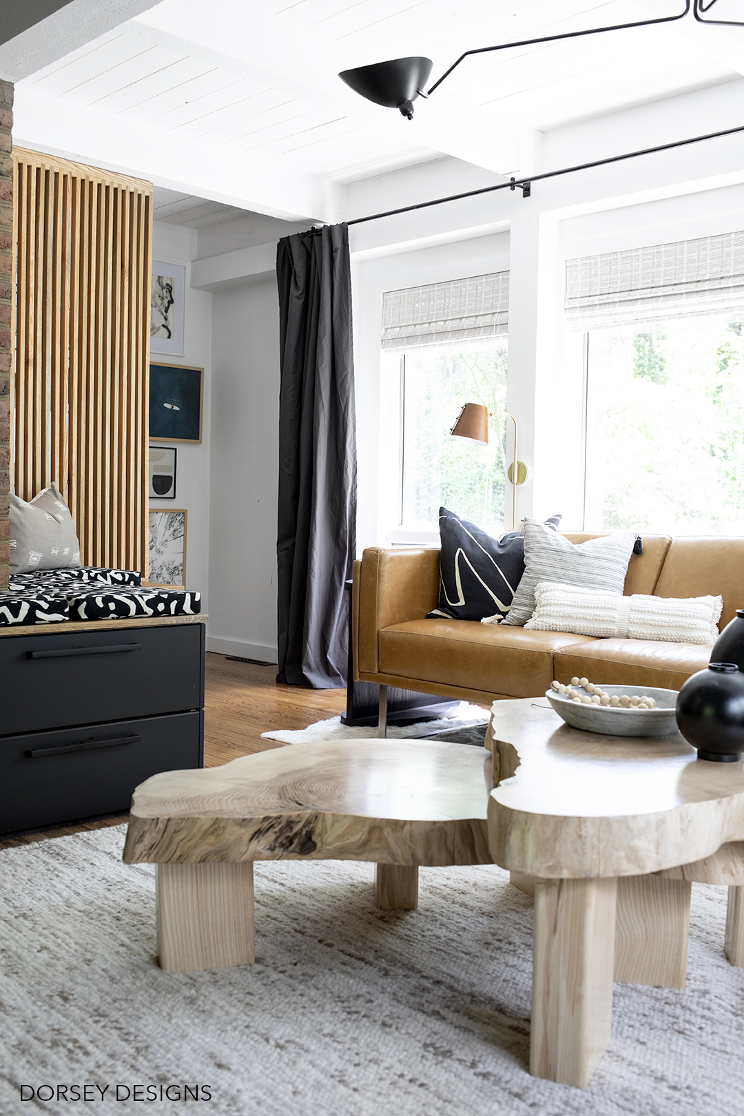
One of the first design elements that I knew we needed to include was a slat wall to cover the hole under the stairs (baby proofing can look good too!) David made it from oak and it’s definitely one of my favorite parts of the room.
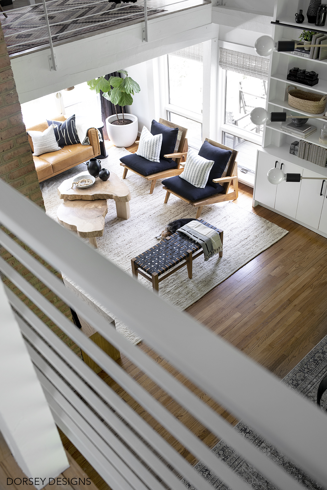
A struggle with the the living room was the space planning – due to the shape – a symmetrical layout wouldn’t work and with the brick, we couldn’t center the 9×12 rug on the sofa. Layering a cowhide from Loloi perfectly hides the fact that the rug isn’t centered on the sofa. It’s faux and so so soft and gorgeous. David actually didn’t believe me that it is faux! It looks so real!
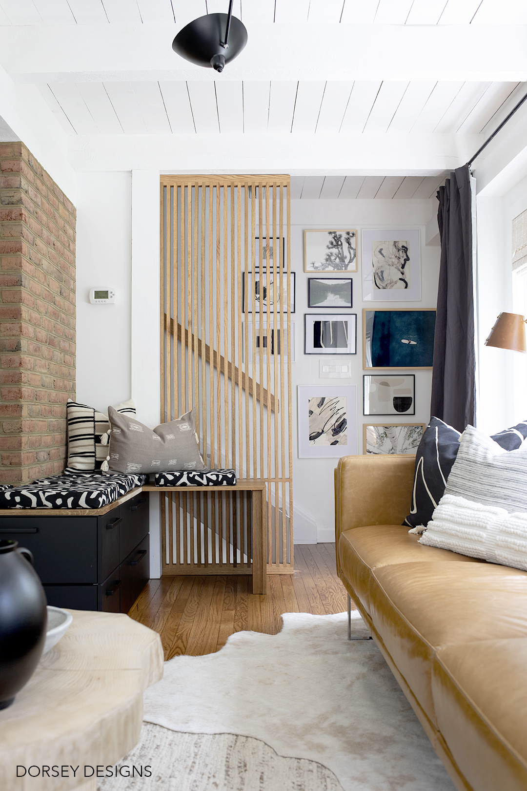
In the basement, we have a wood stove – the brick encloses that and the HVAC duct work for the house. We originally had a faux mantel there – I never really loved it and David really didn’t. I designed this wrap around bench with storage and extra seating (we’ve already been making good use of it!) I love it in this space! Base cabinets are Sektion from Ikea and top is made out of oak. Gorgeous matte black pulls are from Schaub!
I made the modular bench cushions from one of my favorite fabrics from Fabricut. It’s actually one of the first things that I selected for the space. They are 15×15 and can easily move around as needed!
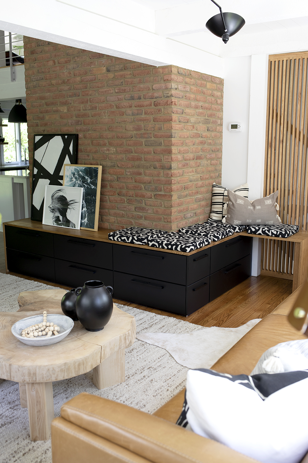
Furniture in the space includes, a gorgeous cognac leather sofa from American Leather. Amazing quality and it is super comfy! The space needed something long and fairly shallow – this first the space perfectly!
Stunning chairs are from Eclectic Goods – I really wanted something with an interesting side view since that’s one of the first things that you see when you come in the room. These are super comfy too!
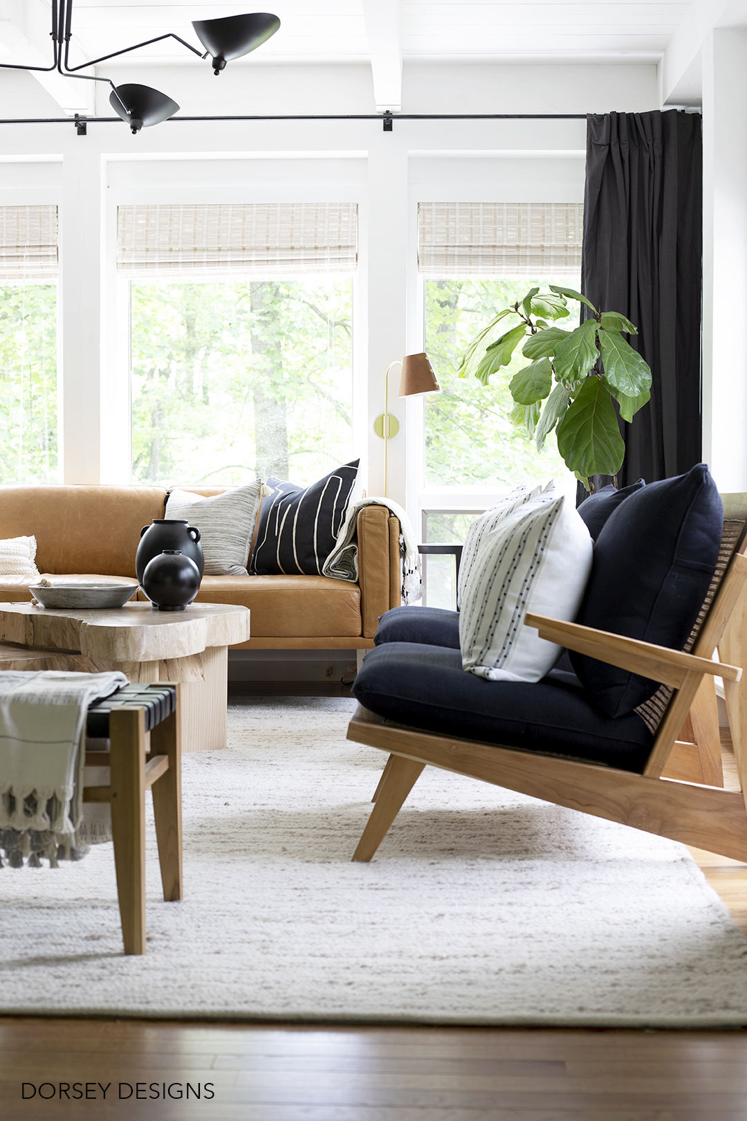
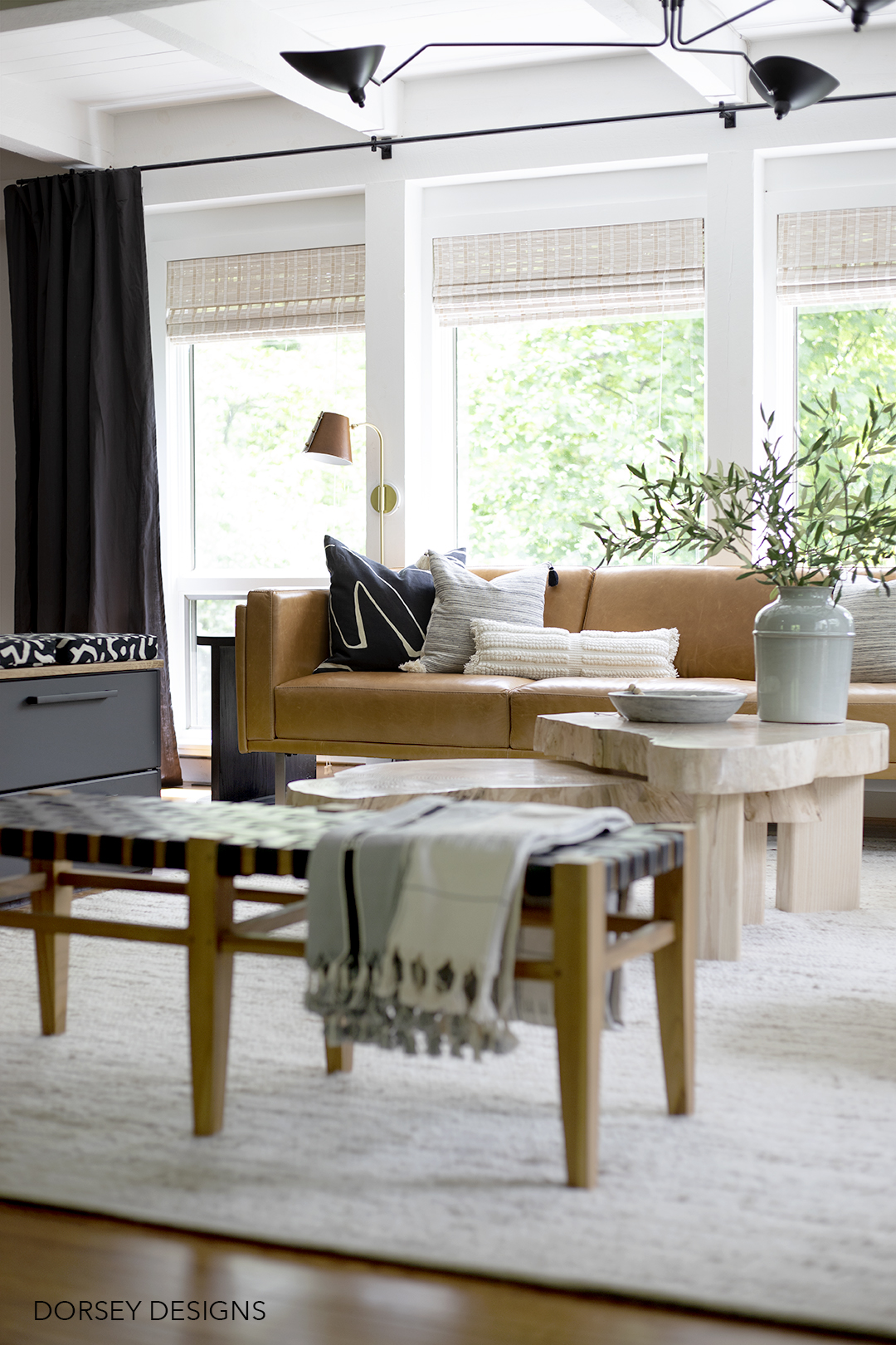
Black leather bench is from Home Goods. Pillows are from SWD Studio (two of my favorite designer patterns!), Ginger and Sparrow, and lumbar is from Target.
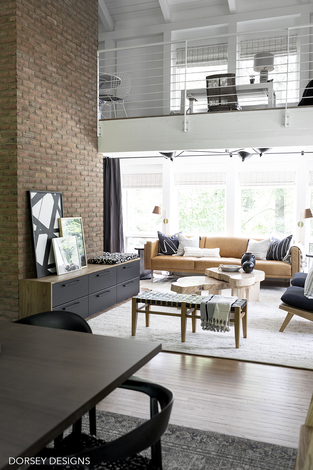
Lots of DIY in the space, but probably my favorite is this set of wood slice nesting tables – made from an Ash tree from our neighbor. Lucky timing, he recently cut down several dead trees and said we could take anything we wanted! David purchased a chainsaw mill to cut thick slices, sanded down and the legs are made from Ash trees from our yard. I wanted the legs to be thick and substantial (for both looks and to support the heavy top!) Once sanded, we applied clear matte floor finish to seal it.
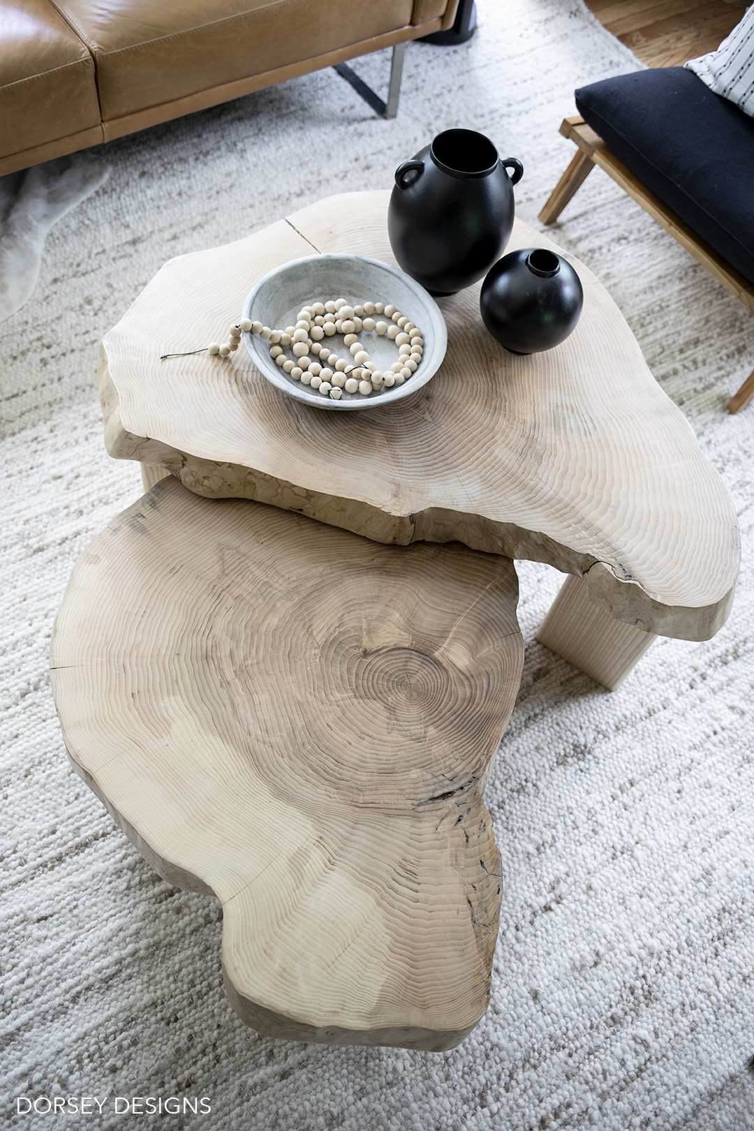
Those legs!
Also, with the low ceiling height, I’ve been on the search for the perfect chandelier. I love the scale of this and that it’s asymmetrical. Light bulbs are from Soraa, they specialize in creating the perfect color temperature for a natural look. Color temperature makes all the difference in LED bulbs!
Sconces are from Mitzi! We wrapped the shade in leather (tutorial in my upcoming book!) Though they are gorgeous on their own, I love the extra warmth that the leather adds.
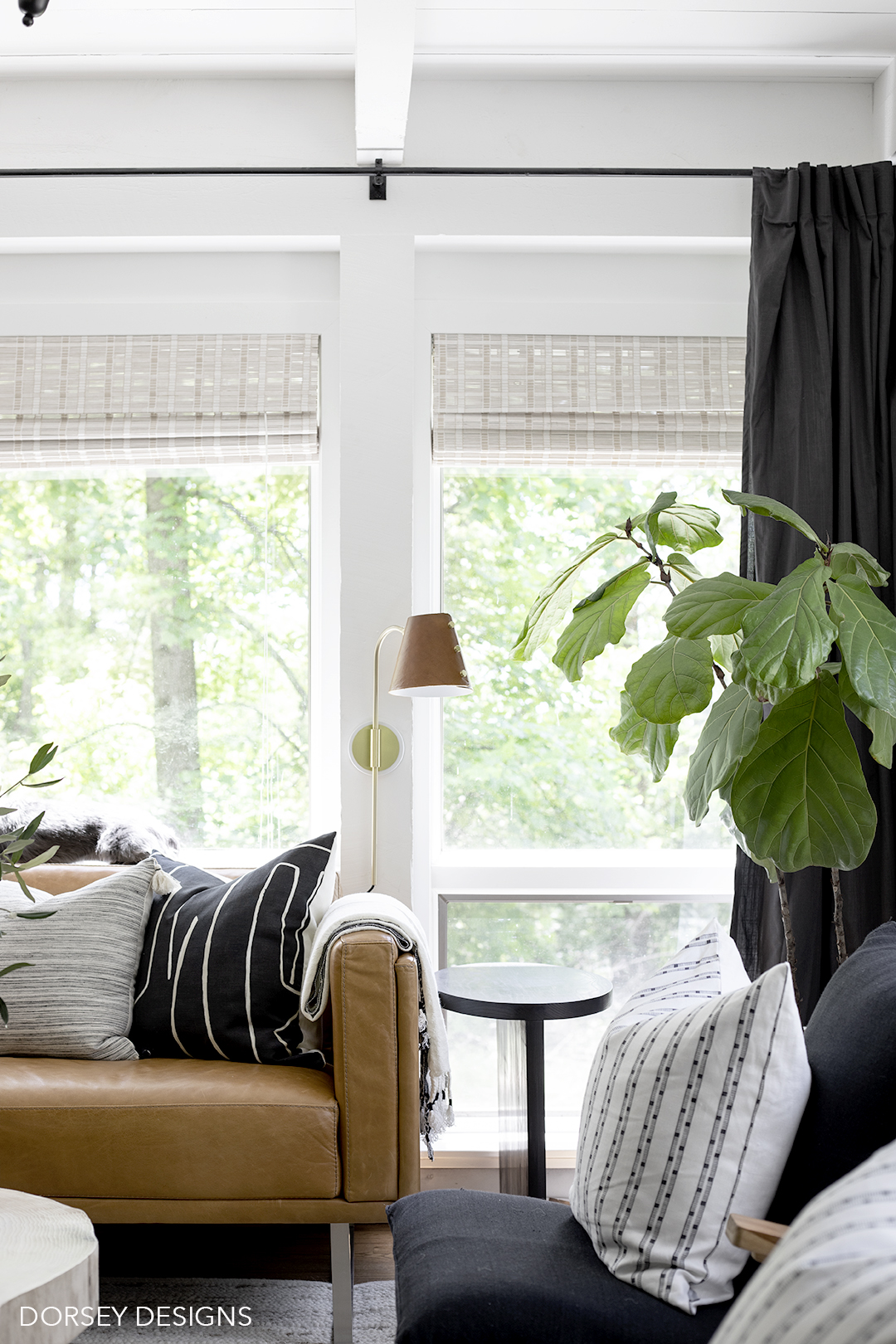
Accessories I’m crazy about – pillows from SWD Studio, Ginger Sparrow and Target (throw is from Ginger Sparrow too!) Super realistic olive tree branches from NDI. I love how versatile they are – I could see them working almost everywhere in my house. I just folded the end, but they could be much taller too! Super pretty!
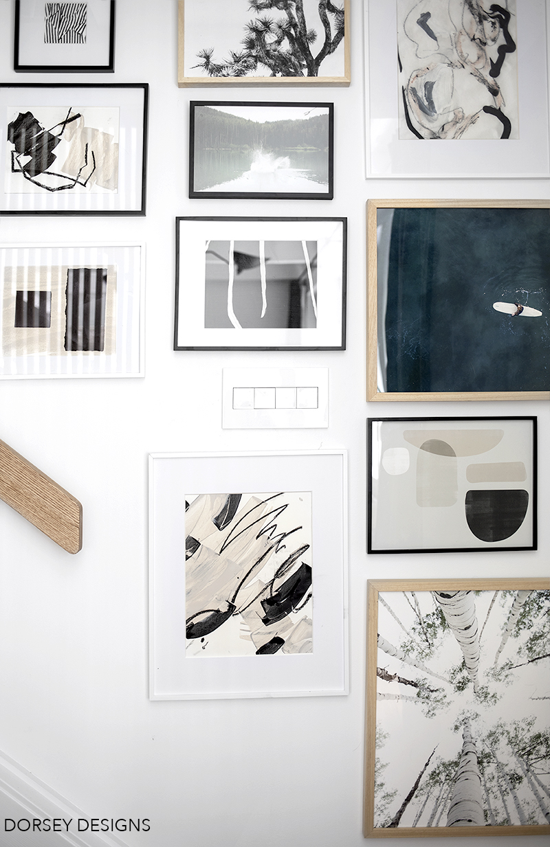
Gallery wall in stairs consists of art from Minted, DIY art, Juniper’s print shop and wallpaper/fabric samples (you can purchase samples of designer fabric to frame!) I love how Legrand’s touch switches from the Adorne collection seamlessly blend into the gallery wall! .
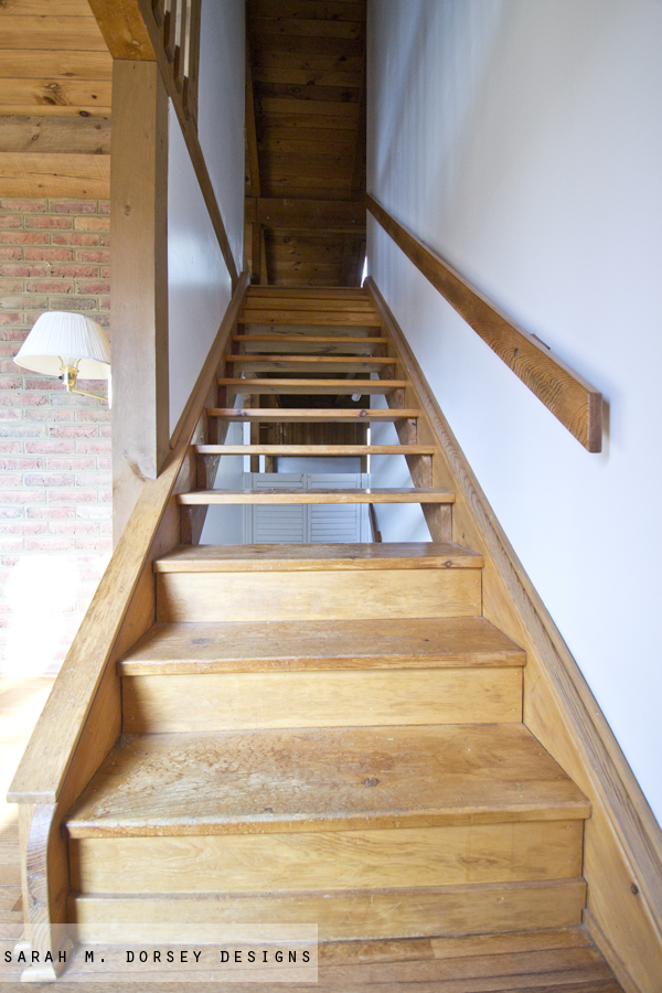
Stairs before
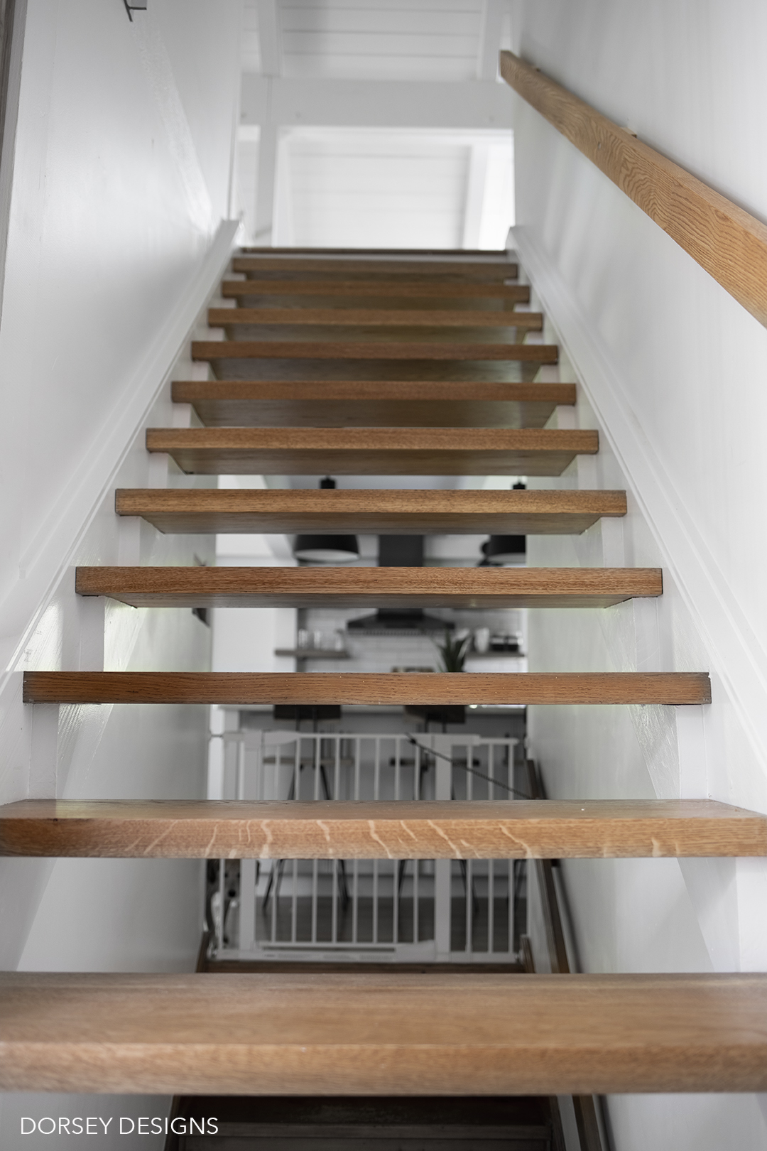
After! We replaced the worn thin pine stairs with thicker oak – they are so solid now and match the oak floor. I also love how silent they are – no more squeaking! Banister was also swapped to oak to match the stairs.
One last before

and after!
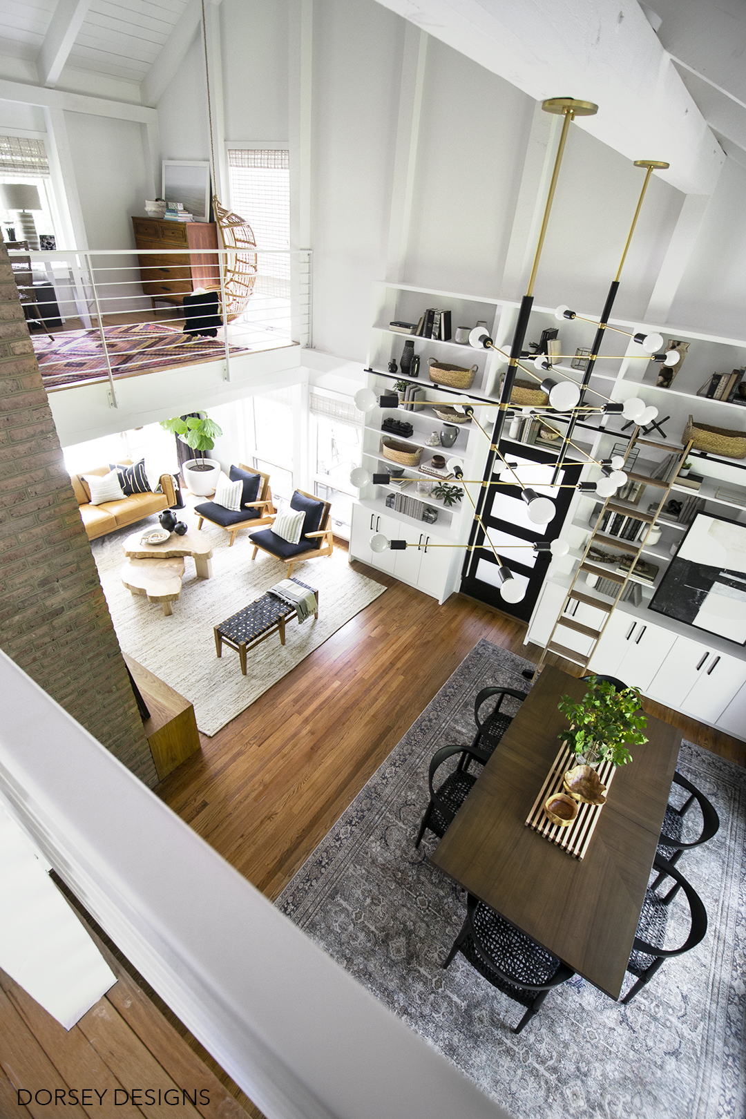
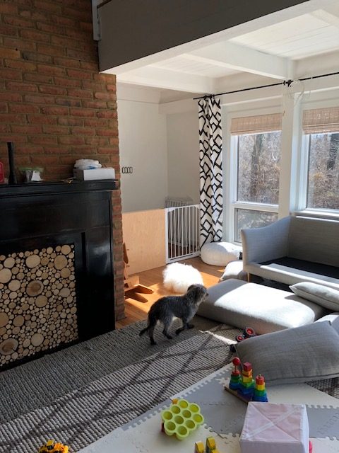
Before (yikes! Thankful for toy storage now)
After!

Thanks so much for stopping by! If you have and questions or would like to see a tutorial for anything, let me know, I will start working on those in the next few weeks. All sources will be listed below!
Dining Room
dining table // dining chairs // chandeliers // large frosted light bulbs // rug // library ladder and library ladder hardware // built in door pulls // drapery // black front door // front door hardware // olive branch arrangement // black sconces // jill rosenwald black bowl // capiz box // black box trio // folded paper art // drapery rod diy // art over built in // long trivet, (diy tutorial in my upcoming book, currently available for pre order!) // light bulbs in sconces // legrand adorne switches and outlets
Living Room
leather sofa (mont blanc sugar cookie leather) // black and teak side chairs // bench (home goods) // rug // cowhide rug // black three arm chandelier // nesting wood slice coffee tables diy // bench cushion fabric // black graffito pillow// lumbar pillow on sofa // white ludo pillow // black and white with tassels, griege lumbar on built in bench, throw on bench // stripe pillow on built in bench // vase on coffee table // olive branches (currently not on website) // beads in bowl diy // bowl on coffee table home sense // sconces (diy leather shade added, tutorial in my upcoming book, currently available for pre order!) // fiddle leaf fig Home Depot planter home goods // black and white art on built in bench // ocean print // abstract hair print // draperies // drapery rod diy // gallery wall art – birch trees // joshua tree // black and white pink abstract art // surfboard //abstract shape art //light bulbs in chandelier // legrand adorne switches and outlets
DIY Tutorials
Did I miss anything? Let me know and I’ll add it!
A HUGE thanks to the sponsors of the One Room Challenge that I featured in our space!
Also a big thanks to The Home Depot for providing the windows, door, and library ladder for the space! And to Eclectic Goods for providing the gorgeous chairs for the living room!
Be sure to check out all the featured designers final reveals!!
At Home With Ashley | Casey Keasler | Dorsey Designs | The Farmhouse Project | Home Made by Carmona | House of Funk | House of Jade Interiors | House Seven Design | House That Lars Built | Inspired by Charm | Jana Bek | Jessica Brigham | Kelly Golightly | Murphy Deesign | The Pink Pagoda | Sarah Gunn | Sherry Hart Designs | Sugar & Cloth | Veronica Solomon | Vintage Revivals | Media Partner BH&G | TM by ORC
Thank you so much to the One Room Challenge™ for inviting me to be a featured designer and pushing me to finally complete this space! This was such a blast!
Thank you to Better Homes and Gardens – the One Room Challenge™ Media Partner! #BHGORC
As always, I only share companies and products that I love and have had a good experience with! Thank you for your support!!
Worth. The. Wait! God everything in here came together beautifully!!! I can’t with those chandy’s and I’m looking at those dining room chairs as we speak. So happy to hear your little expects to make a full recovery too. Hoping you can all relax and enjoy this space together now!
Thank you kayla! That means so so much!
Wow, this looks amazing. Very impressive and worth wait. More importantly so happy to hear that your son will be okay. It must have been a harrowing time for all of you.
Thank you so much! We are so glad that he is headed in the right direction!
Sarah, I have been following you for quite awhile and you have outdone yourself here, this is spectacular! Amazing flow and vision for the space! You rocked it! So glad you son is okay as well❤️
Thank you Kristi! That means so much!!
Everything looks so good! I love how you really used your space to your advantage, even with lots of logistics to consider. This is one of my favorites from the entire ORC. Great job!
Also, so glad your little one is doing better. Injury and hospital stays and everything else that goes along with it are terrifying. I am so glad your son is on the mend. Here is to a smooth recovery!
Thank you Caroline!! 🙂
Jaw is on the floor!!!!! Wow. Just wow!
Thank you Shelley!!!
it could not be better! i am in LOOOVE, sarah! every details is amazing!!!!!
Thank you Cassie!! 🙂
I knew I was going to love your ORC makeover, but you surpassed my high expectations! I love everything in the room and love forward to getting your book when it comes out. Have a great holiday weekend in your beautiful space.
Thank you Amanda, that means so so much!
As usual, absolutely amazing. Can I get some coffee tables like yours?!
Thank you so much Teri! I’m planning to post a tutorial soon!
Beautiful reveal! I love everything!!
Also, glad your son is doing better. It’s so hard when little ones get hurt or sick.
Thank you so much Jacqueline!!
It looks fab. Well worth the delay and so pleased your son is ok.
Thank you so much for your support Eva!!
Wow Sarah! It looks fab! The whole makeover is stunning, and those wood slice tables oh-my! Carolina at Ironmongery Experts.
Thank you so much Carolina! That is definitely one of my favorites too!
LOVE LOVE LOVE LOVE LOVE. I couldn’t love this more!
Thank YOU Alison!
I agree, so worth the wait. Glad your little man is doing better.
How do we preorder your book? Love your creativity (and your hubby’s too).
Thank you so much! We are so glad that he is doing better too 🙂 Here’s the link for my book! https://www.amazon.com/Big-Style-Small-Spaces-Apartment/dp/1624147887/ref=sr_1_1?keywords=Sarah+Dorsey&qid=1558648899&s=gateway&sr=8-1 (also linked in sources section)
Wow Sarah, you outdid yourself once again! I don’t know what I love most, those windows are stunning & the built ins are brilliant! Congrats on another amazing makeover!
Thank you so so much Jana!! 🙂
Love, love, love your designs!! Those ash tables are fabulous! Your rooms are so pretty! And, you know how happy we are that John is on the mend!
Thanks Aunt Deb!
Wow! What an incredible transformation. Every detail is spectacular. Where did you source the living room blinds? They look almost like bamboo but maybe not?
Hi Emily! They are from Overstock, if you search white wash bamboo roman shade they should pop up 🙂 I’ll add the link to the sources shortly
Thank you 😊
You’re welcome 🙂
This turned out gorgeous. PLEASE show us your toy storage! And does your boy not want to throw small accessories and those olive branches everywhere? My house definitely can not have smaller beautiful things unless they’re out of the reach of my toddlers. Lol!
Hi! I’ll have to do a follow up post with our toy storage! Unfortunately, I had to take everything off of the coffee table, but all the accessories on the built in have stayed – just have to keep him off of the chairs! But, it’s been working pretty well!